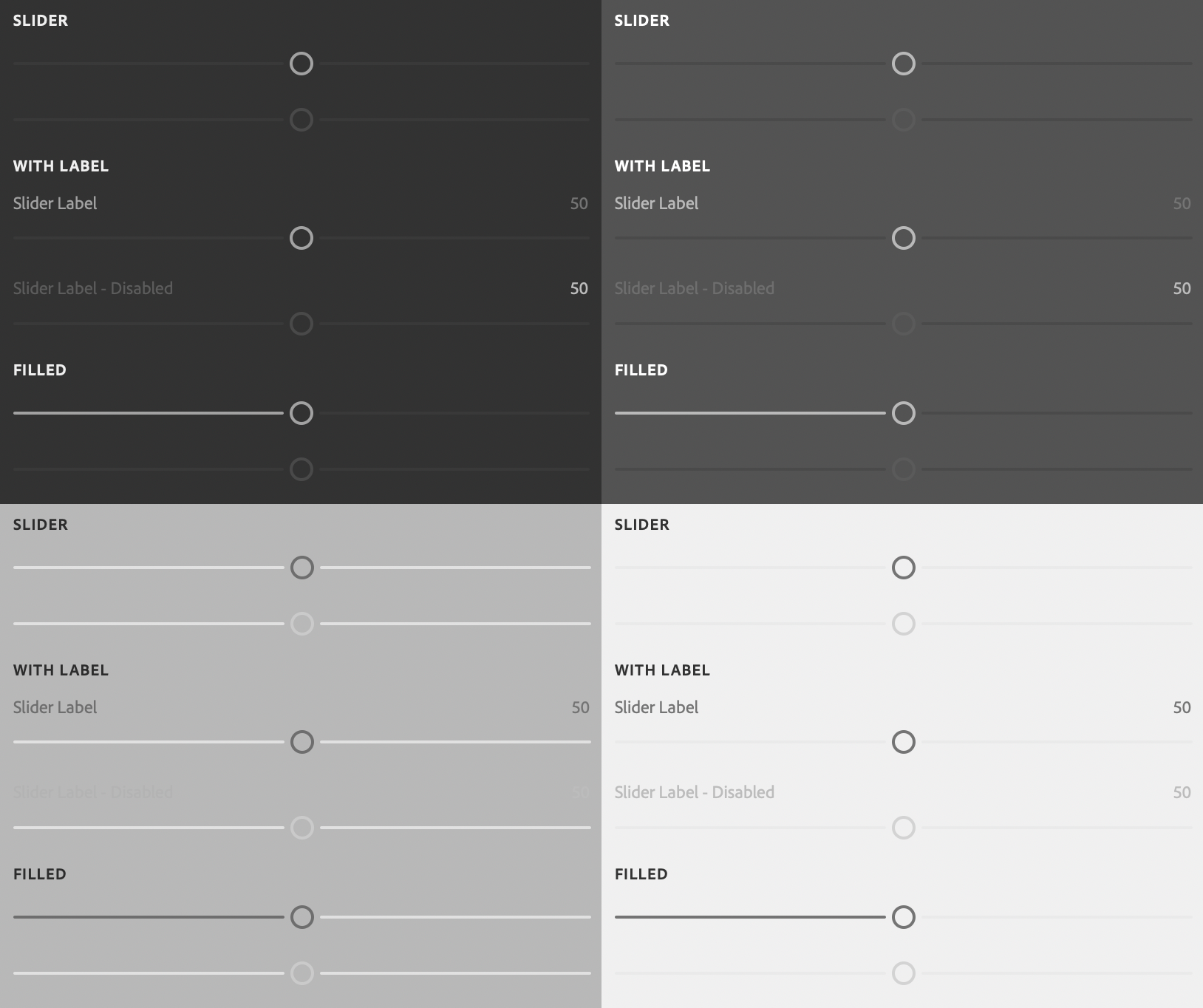
sp-slider
Since: UXP v4.1
Renders a slider with optional associated label.

See:
- https://spectrum.adobe.com/page/slider/
- https://opensource.adobe.com/spectrum-web-components/components/slider
Example
Copied to your clipboard<sp-slider min="0" max="100" value="50"><sp-label slot="label">Slider Label</sp-label></sp-slider>
Variants and states
There are several different variants for sliders.
Disabled
Indicates that the slider is disabled.
Copied to your clipboard<sp-slider disabled min="0" max="100" value="50"></sp-slider>
Filled
Fills one side of the slider track. Which side is specified with fill-offset.
Copied to your clipboard<sp-slider variant="filled" fill-offset="left" min="0" max="100" value="50"></sp-slider><sp-slider variant="filled" fill-offset="right" min="0" max="100" value="50"></sp-slider>
Custom unit
You can specify a custom unit for the slider value -- such as "%".
Copied to your clipboard<sp-slider value-label="%" min="0" max="100" value="50"></sp-slider>
Hiding the value
You can hide the slider value.
Copied to your clipboard<sp-slider show-value="false" min="0" max="100" value="50"></sp-slider>
Responding to events
You can respond to changes on the slider using the change and input events.
Copied to your clipboarddocument.querySelector(".yourSlider").addEventListener("input", evt => {console.log(`New value: ${evt.target.value}`);})