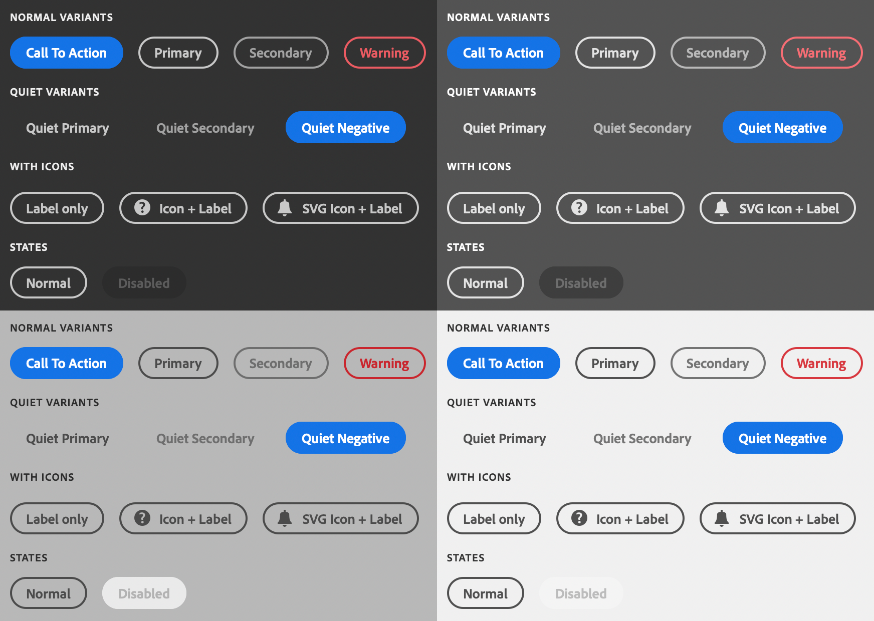
sp-button
Since: UXP v4.1
Renders a button.

See:
- https://spectrum.adobe.com/page/button/
- https://opensource.adobe.com/spectrum-web-components/components/button
Example
Copied to your clipboard<sp-button>Vectorize</sp-button>
Variants
There are several variations that are supported.
Call to action
Renders a "call to action"-style button. This is the default variant if no variant is provided.
Copied to your clipboard<sp-button variant="cta">Click me</sp-button>
Primary
Renders a "primary" button.
Copied to your clipboard<sp-button variant="primary">Click me</sp-button>
Secondary
Renders a "secondary" button.
Copied to your clipboard<sp-button variant="secondary">Click me</sp-button>
Warning
Renders a button intended to be used to indicate negative consequences to the action, such as an action that can't be undone.
Spectrum Web Components now uses a negative variant. This will be addressed in a future update.
Copied to your clipboard<sp-button variant="warning">Click me</sp-button>
Over Background
Renders a button that's suitable over a background (such as an image).
Copied to your clipboard<sp-button variant="overBackground">Over an Image</sp-button>
Disabled
Copied to your clipboard<sp-button disabled>Disabled</sp-button>
Quiet
Quiet buttons do not have a border, and are less visually distracting.
Quiet buttons do not support the cta variant.
Copied to your clipboard<sp-button quiet>A quiet button</sp-button>
With icon
Built-in SVG icon
Copied to your clipboard<sp-button><sp-icon name="ui:Magnifier" size="s" slot="icon"></sp-icon>Zoom</sp-button>
Custom SVG icon
Copied to your clipboard<sp-button><div slot="icon" style="fill: currentColor"><svg viewBox="0 0 36 36" style="width: 18px; height: 18px;"><path d="M33.567 8.2L27.8 2.432a1.215 1.215 0 0 0-.866-.353H26.9a1.371 1.371 0 0 0-.927.406L5.084 23.372a.99.99 0 0 0-.251.422L2.055 33.1c-.114.377.459.851.783.851a.251.251 0 0 0 .062-.007c.276-.063 7.866-2.344 9.311-2.778a.972.972 0 0 0 .414-.249l20.888-20.889a1.372 1.372 0 0 0 .4-.883 1.221 1.221 0 0 0-.346-.945zM11.4 29.316c-2.161.649-4.862 1.465-6.729 2.022l2.009-6.73z"/></svg></div>Edit Text</sp-button>
Responding to events
You can respond to a click on the button using the click event.
Copied to your clipboarddocument.querySelector(".yourButton").addEventListener("click", evt => {console.log("Button clicked");})